My next project – a variable revival of Microgramma. I’m still undecided about whether to create a lighter weight below the regular. I’m not undecided about wanting to create narrower and wider widths than stretta and larga though.
My next project – a variable revival of Microgramma. I’m still undecided about whether to create a lighter weight below the regular. I’m not undecided about wanting to create narrower and wider widths than stretta and larga though.
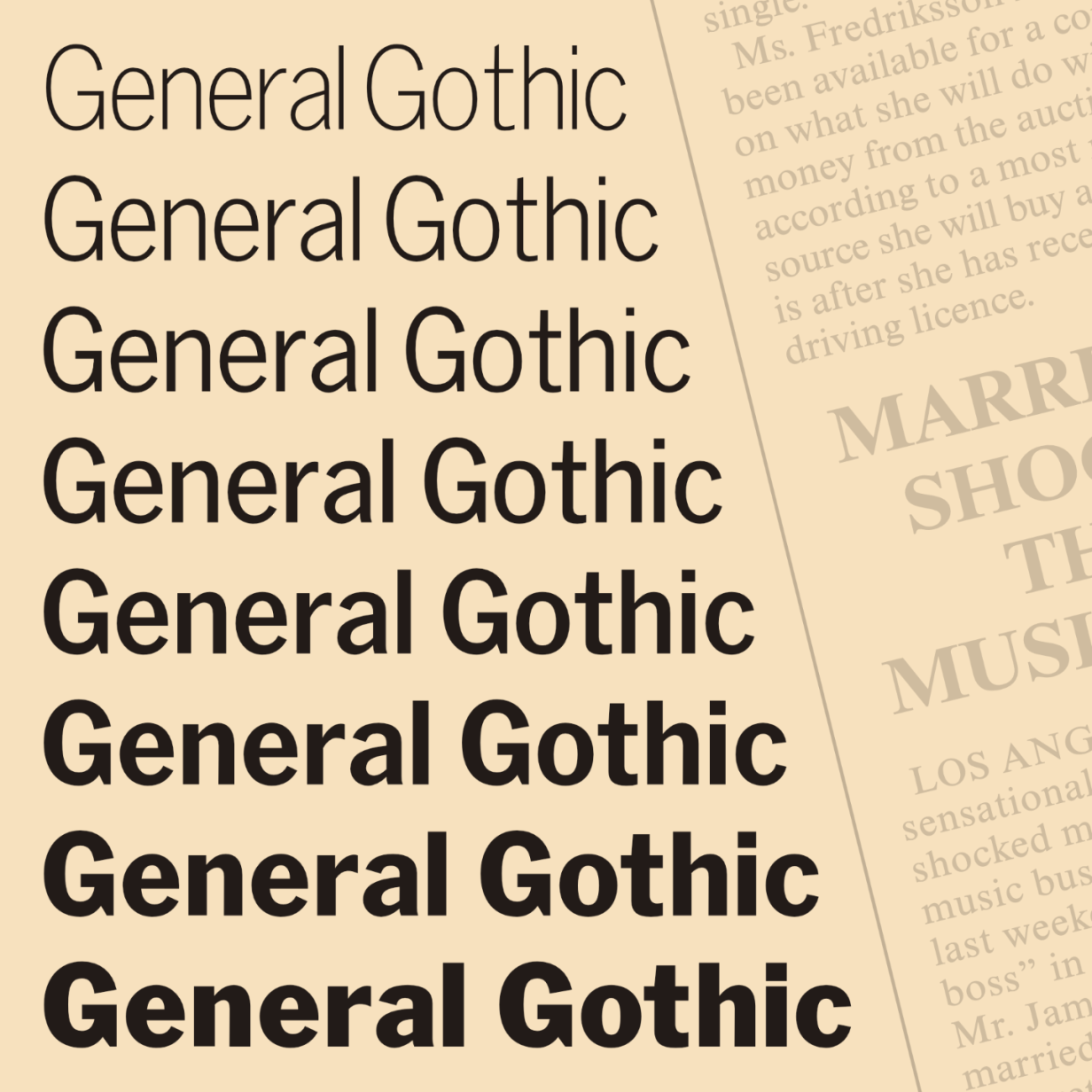
After wrapping up the initial release of General Gothic, I did some housekeeping and found another font that I’d let languish.
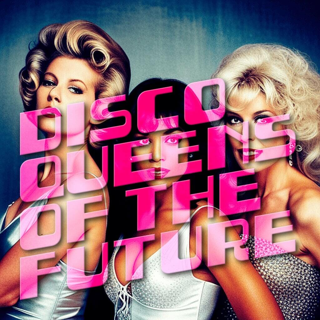
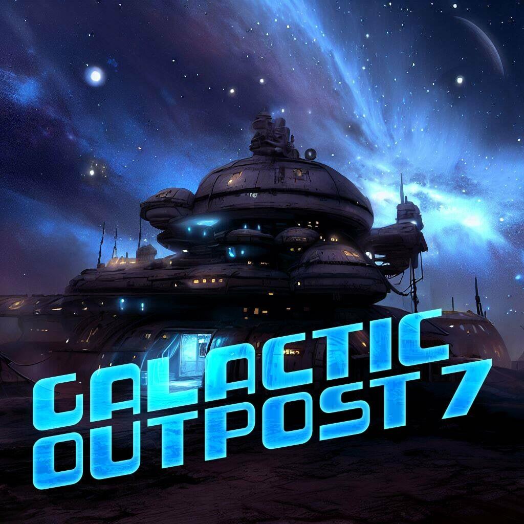
Art Disco is precisely what it sounds like – a font where Art Deco meets Disco. You could even get some decent retro sci-fi lettering out of it with a bit of effort.
It’s bare-bones right now – uppercase letters and numbers only. I’ll add some punctuation, accented characters and hinting down the line.
Get it from barry.mieny.com/fonts/art-disco.html
I’d run out of steam a few months ago after drawing roughly the same design three times in a row, except for the numbers of the light master. This morning I finally sat down and hammered out the last ten glyphs.
Not an original design, but here’s version 0.1 of General Gothic. It’s an interpolated family based on Lightline Gothic, News Gothic and Franklin Gothic.
It’s far from perfect, but I’ll iron out the kinks over time and increase the glyph coverage.
Get it from barry.mieny.com/fonts/general-gothic.html


What do you do when:
Can’t we just go back to Web 1.0?
Things seemed simpler with forums, (some) open protocols, just enough CSS to be dangerous, etc, etc.
The currently unfolding story around the demise of Apollo is just depressing.