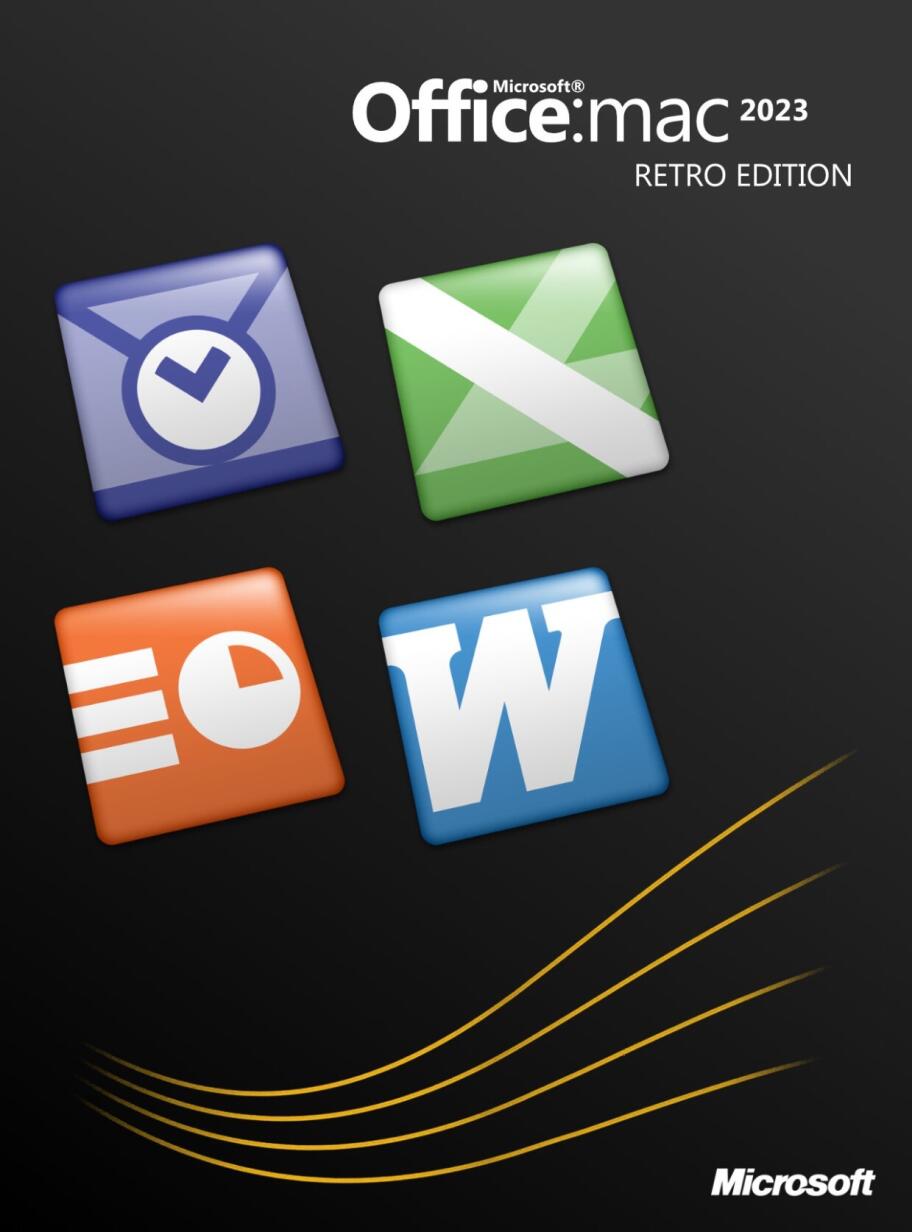
So, a little over 15 years ago, I finished a retro-inspired Microsoft Office icon set in the style then defined by the HIG for applications. And then I forgot to release them. I completely forgot I even made them. So this is probably as good a time as any to unleash them onto the world for those who still like to customise their icons: barry.mieny.com/icon/slanted.html (Mac .icns only, sorry.)
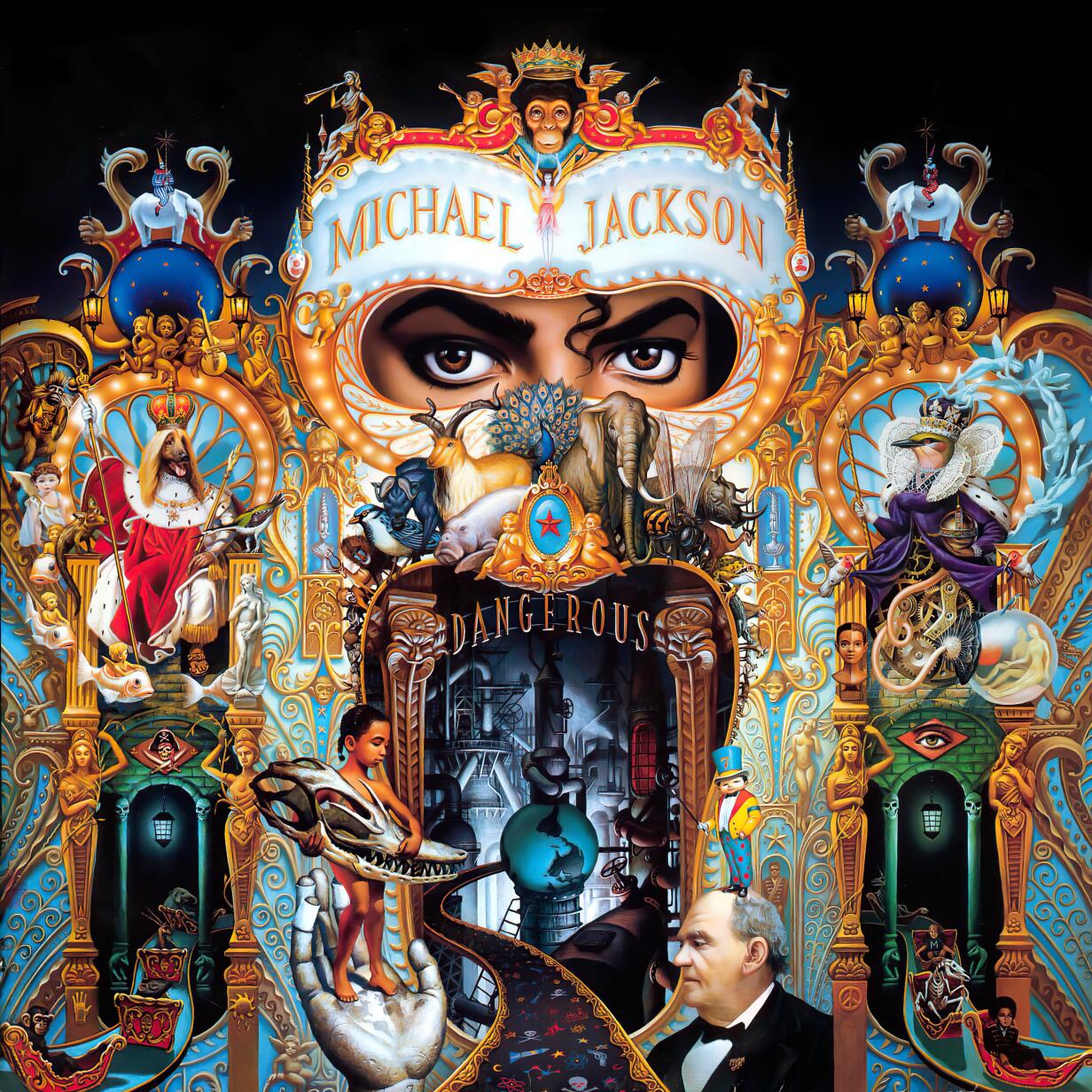
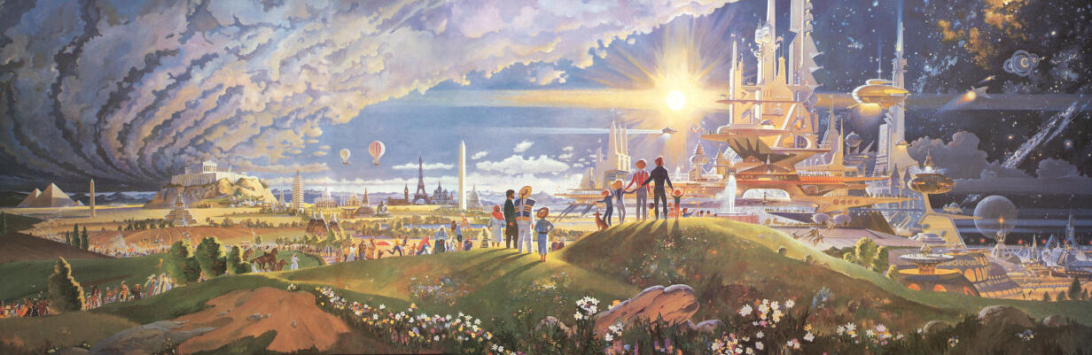
Probably one of the best album covers ever.
Y’all told me Andreesen was smart, Thiel was smart, Rabois was smart, Musk was smart, they have all outed themselves as lucky and dumb. You need to stop assuming being rich and being smart are the same.

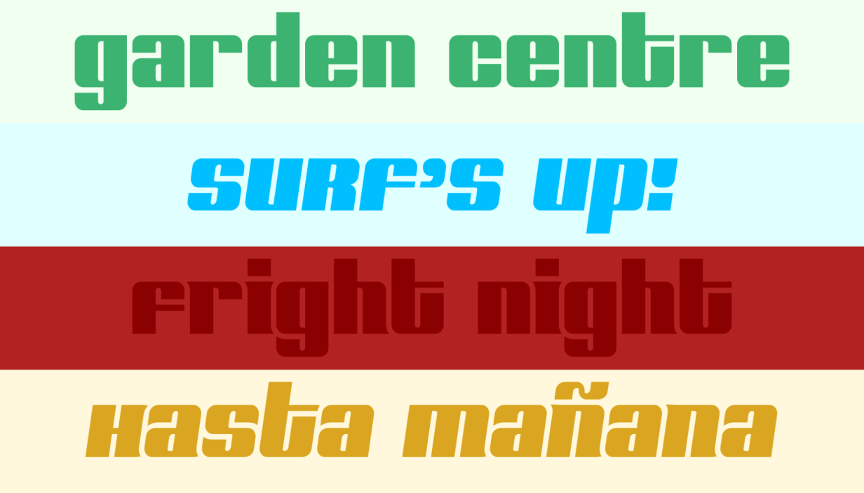
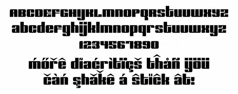
This is (working title) Barry. It’s based on a logotype I’ve been using since around 2008, and I still need to come up with a more appropriate name.
I started work on it shortly after the logotype, but there are still some things I’d like to do before considering it 1.0.
It already has comprehensive diacritic coverage but needs more fleshing out.
The swash feature enables an alter ego, and there’s also support for narrow diacritics on IiJj, and narrow Jj to avoid collisions with descenders.